
A friend of mine (Dane) introduced me to a new plotting library for Home Assistant. It is the Plotly Graph Card, with the promise that it was more performant than the one that I had already been using, and would allow for more dynamic graphs, I was sold.
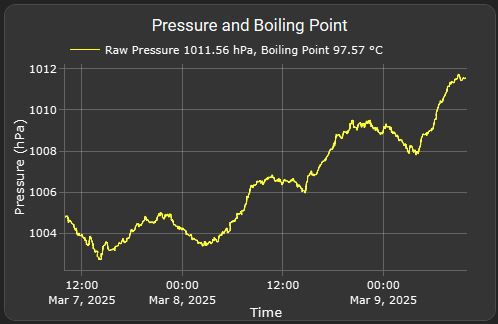
Air Pressure Chart
I looked at my existing dashboard and decided that the easiest graph to update was my Air Pressure, and as a bit of a stretch, I wanted to also calculate the boiling point of water based on the Ecowitt Weather Station that I have, and the elevation above sea level.
type: custom:plotly-graph
title: Pressure and Boiling Point
entities:
  - entity: sensor.gw1100c_relative_pressure
    type: line
    name: |
      $ex {
        const raw_pressure_hPa = parseFloat(ys.at(-1));

        // Manually set the elevation value as we cannot grab the elevation of Home Assistant
        const elevation_m = 722;  // Replace 722 with your actual elevation value in meters
        const P1 = 1013.25; // Standard atmospheric pressure in hPa
        const T1 = 373.15; // Boiling point of water at standard pressure in Kelvin
        const delta_H_vap = 40790; // Enthalpy of vaporization in J/mol
        const R_gas = 8.314; // Universal gas constant in J/(mol·K)

        // Apply the known formula for pressure drop with elevation
        const corrected_pressure_hPa = P1 * Math.pow(1 - (6.5 * elevation_m / 288150), 5.255);

        const P2 = corrected_pressure_hPa;
        const T2 = 1 / ((1 / T1) - (R_gas * Math.log(P2 / P1) / delta_H_vap));
        const boiling_point_C = T2 - 273.15; // Convert from Kelvin to Celsius

        // Construct the line name based on the current value
        return `Raw Pressure ${raw_pressure_hPa.toFixed(2)} hPa, Boiling Point ${boiling_point_C.toFixed(2)} °C`;
      }
    line:
      width: 1
      shape: spline
      color: yellow
    statistic: mean
    period: 5minute
layout:
  yaxis:
    title: Pressure (hPa)
    side: left
  xaxis:
    title: Time
  showlegend: true
hours_to_show: 48
refresh_interval: 10
Daily Relative Humidity Chart
My previous graph of the Relative humidity was good, it showed me what the maximum was, but I was always wanting a way to show the minimum. Mainly because almost every single day, the humidity was 99%. So in the re-implementation, I overlayed the daily minimum. There is still some tuning that I would like to do on this graph. In my ideal situation, the min humidity makes the max transparent, so that you only have a floating bar, somewhat similar to how a Box Plot would work.

type: custom:plotly-graph
title: Daily RH
entities:
  - entity: sensor.gw1100c_humidity
    type: bar
    name: |
      $ex "Max Humidity " + parseFloat(ys.at(-1)).toFixed(2) + "%"
    statistic: max
    width: 40000000
    period: day
    marker:
      color: "#9dccf5"
    opacity: 0.8
  - entity: sensor.gw1100c_humidity
    type: bar
    name: |
      $ex "Min Humidity " + parseFloat(ys.at(-1)).toFixed(2) + "%"
    statistic: min
    width: 80000000
    period: day
    marker:
      color: black
    opacity: 0.8
layout:
  yaxis:
    title: Humidity
    side: left
  xaxis:
    title: Time
  showlegend: true
  bargap: 0.5
hours_to_show: 672h
refresh_interval: 10